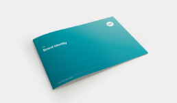
Brand identity
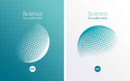
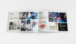
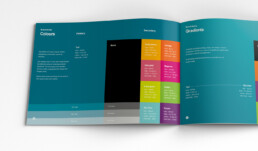
One of the first tasks was a brand refresh. With the only limitation being that the logo had to remain the same, I had creative freedom to turn the flat and corporate identity into something more fun, friendly and energetic. This included a new colour palette, the addition of gradients, icons and new imagery. To tie it all together – a new brand guidelines document.
During the process another problem presented itself – brand guidelines were continually updating and shared as PDFs, so often, certain divisions or departments would be working from an older version. While this wasn’t a requirement, I conceptualised a solution of an online brand document where employees could not only get the most up-to-date guidance, but have access to brand assets like logos, icons and imagery.
Due to time constraints, the site never launched but I think it holds up very well as a solution. Here’s a working prototype.
175th Anniversary
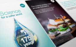
To celebrate LGC’s 175th anniversary, I was tasked with creating a video highlighting the company’s history along with showcasing current products & services. I opted for an ambitious 2D animated video which I think perfectly reflects and conveys LGC’s story.
Asset creation
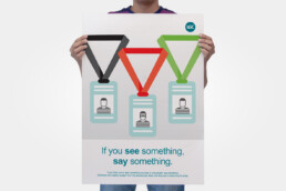
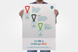
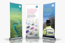
Alongside these projects was business as usual – countless posters, banners and leaflets that were placed throughout LGC’s headquarters and conceptual work for the next iteration of the brand identity.