Design System
Email components
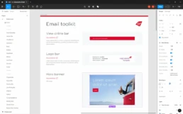
As an extension to the existing Virgin Atlantic Design System, I was solely responsible for creating all new and existing email components within Figma. This included variants for desktop, mobile and dark mode enabled devices.
Due to the (many) limitations within email, much of the existing functionality from the Design System had to be re-thought and re-worked to ensure compatibility across all email clients, while continuing to align with the overall look-and-feel for a consistent customer journey.
24
Components
242
Variants
Design System
Email builder
With all components and variants published, marketing managers are now able to design and customise their own emails in a matter of minutes.
This frees up resources not only for designers – who can focus more on innovation, bespoke briefs or other tasks, but also the marketing managers themselves – with less time briefing in and waiting for design assets.
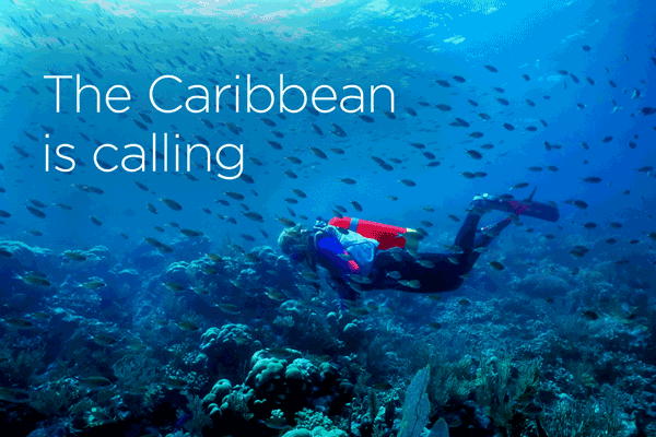
Email Campaigns
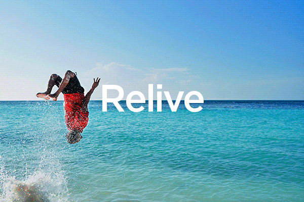
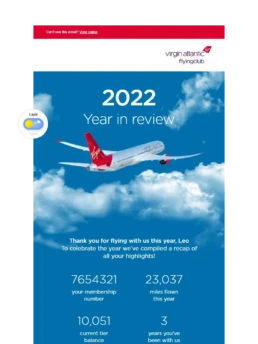
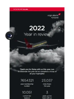
Year in review
Inspired by Spotify Wrapped and the first of it’s kind for Virgin Atlantic, the year in review campaign was designed from the ground up, using bespoke components, animation, live pricing and boasting a build complexity like no other.
The concept stemmed from the idea of scrolling through the sky, content separated through layers of clouds and the iconic Virgin Atlantic plane hovering at the top.
This was one of my favourite project outcomes – the clean, coherent aesthetic along with a dark mode version that reflected in it’s overall success and engagement.
100k
Email opens
2x
Average industry open rate
3x
Average industry click-through rate
Email Campaigns
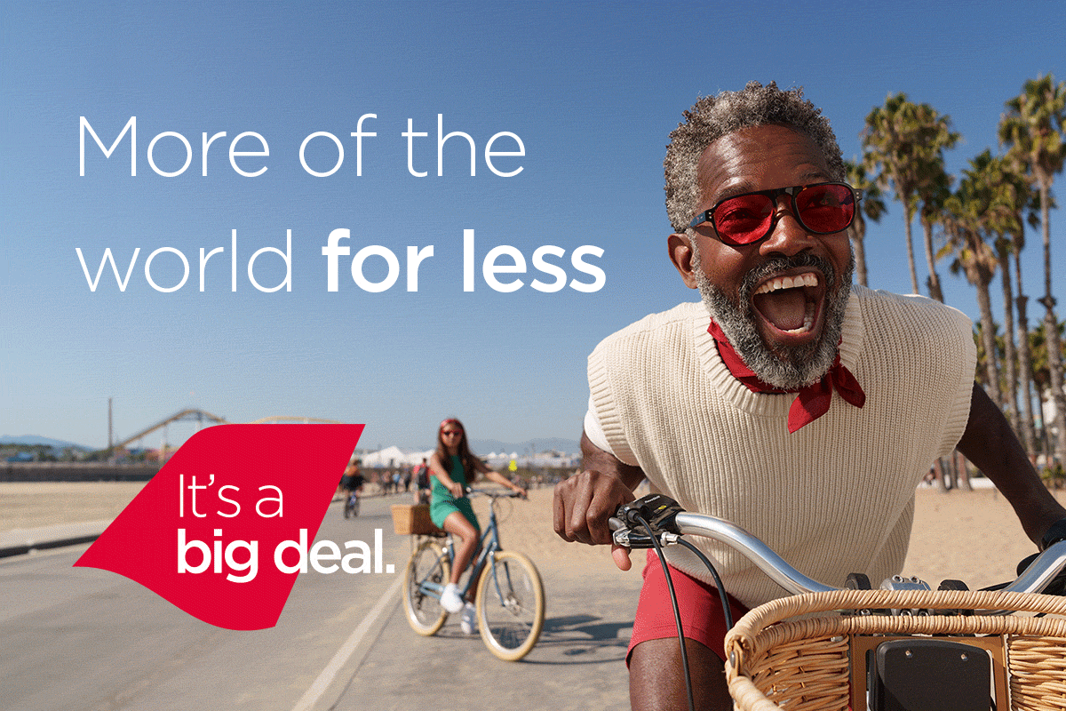
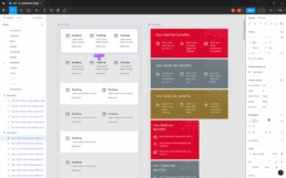
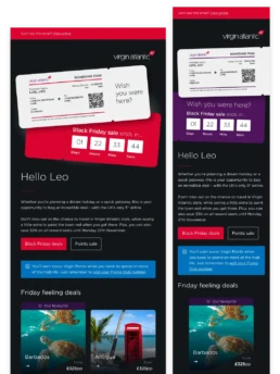
Black Friday
Opting for a dark mode only approach, the concept began with a plane ticket design. In it, a ton of personalisation – customer name, membership details, a target destination based on recent activity and their most likely cabin to fly in. To top it off, a countdown timer to the end of the sale. This turned the campaign into the most personalised to date.
Further down, I created bespoke coloured ‘labels’ on the destination components which not only created more visual disparity between them, but gave the business the opportunity to push particular destinations, highlight what’s popular and show how many people are looking at what – creating a sense of urgency and increasing likelihood to engage.
Overall, the campaign was a massive success.
16,921
Email variations
922%
Upper Class revenue uplift
241%
Overall revenue uplift
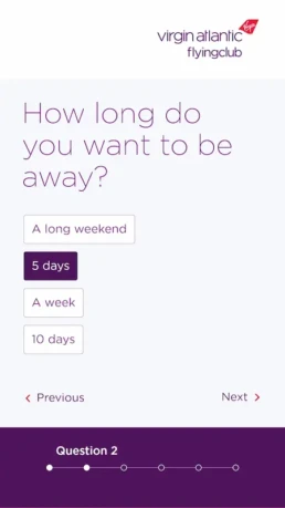
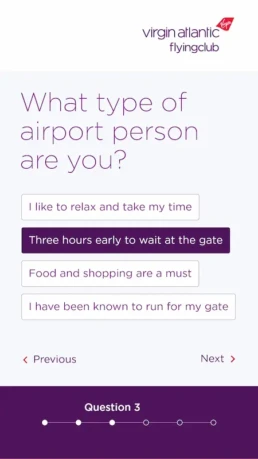
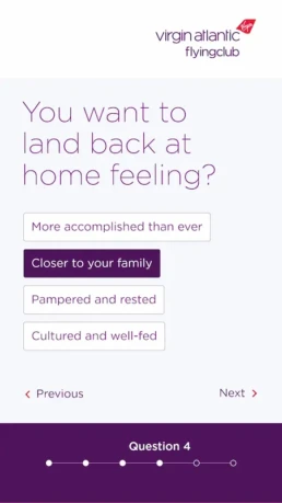
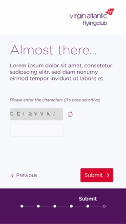
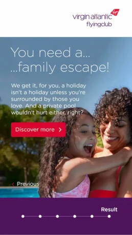
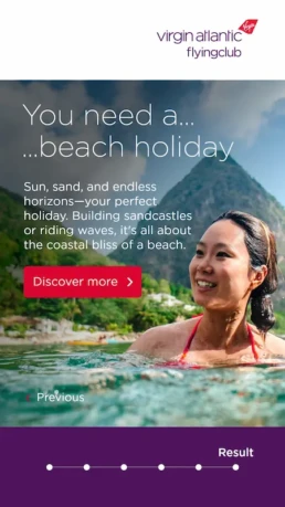
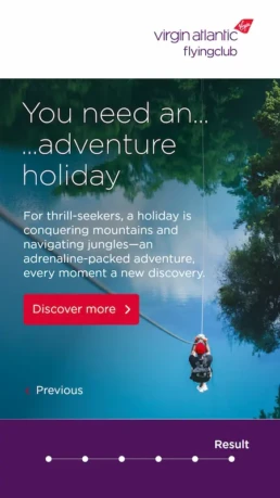
Web Apps
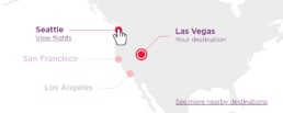
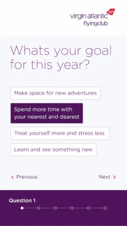
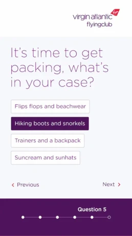
The perfect holiday
As an extension to CRM comms and to give customers an opportunity to interact with something fun and engaging, landing pages and web applications were often used as an intermediary between email and website.
In this case, a questionnaire-like web app which, using particular logic, would identify the perfect type of holiday for the customer. This is the working prototype I put together – have a go and see what your perfect holiday is!
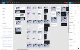
Asset creation
Motion design
Among the thousands of assets created, a number of them were animated headers, banners and components. While never a requirement, my passion for clean, subtle motion, coupled with it’s increased likelihood for attention and interaction, meant it was always a consideration.